
How I Fixed a High-Drop Landing Page for Rakuten Europe Bank
00

Overview
Rakuten Europe Bank is part of the Rakuten Group, offering digital financial services across Europe through products like Rakuten Pay and Rakuten Point. As the platform grew, the landing page evolved into a single entry point for both personal and business users — but without clear structure or direction. This project focused on simplifying the experience by creating a more structured, user-focused journey that enables faster understanding and action.
Problem
The landing experience was product-led instead of user-led, immediately surfacing features like Rakuten Pay without establishing context or relevance. Content was unstructured and mixed across audiences (personal and business), with no clear entry point or guided flow. Users were expected to interpret the experience on their own. The result was high cognitive load, weak hierarchy, and unclear next actions — leading to friction at the very first interaction.
Solution
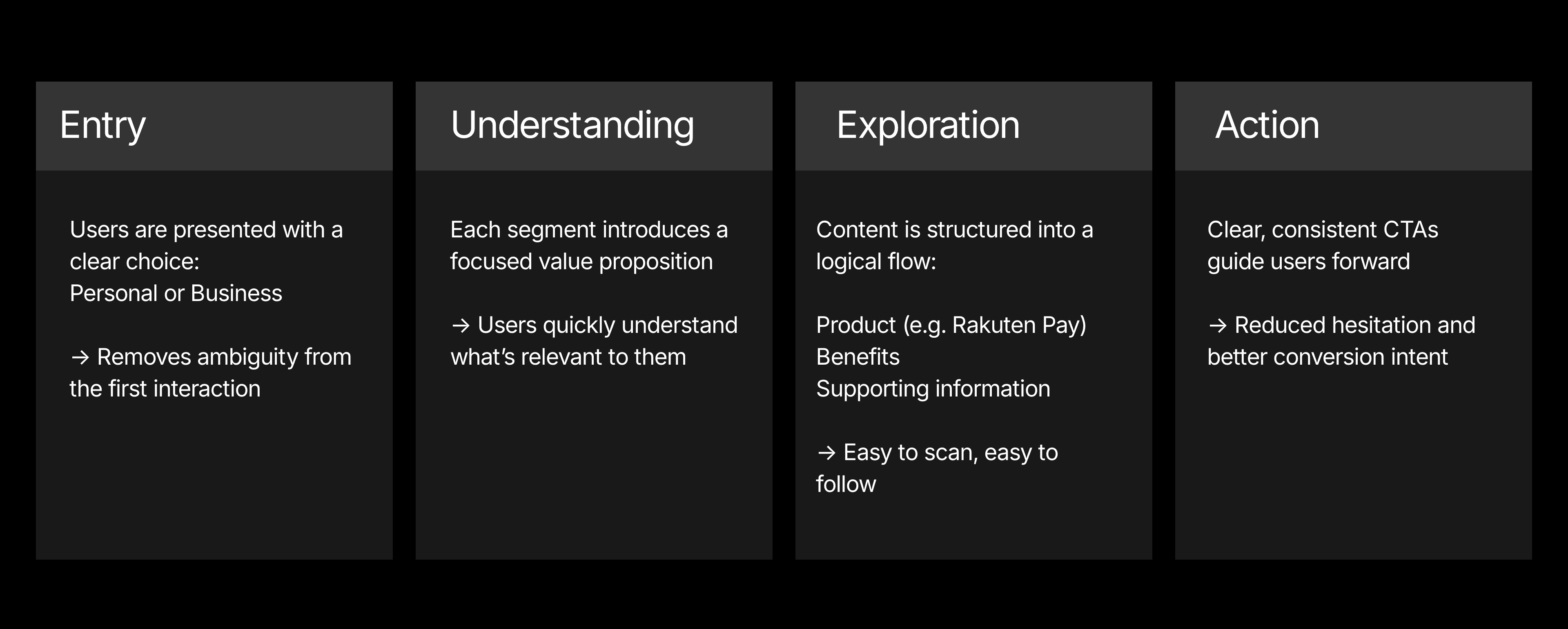
I reframed the experience from “what we offer” to “who this is for.” The redesign introduces a clear Personal / Business segmentation at the top, allowing users to immediately choose their path and access relevant content. From there, the page follows a structured, narrative-driven flow — starting with a focused value proposition, followed by product highlights (such as Rakuten Pay), benefits, and clear calls to action. Visual hierarchy was rebuilt to guide attention, reduce noise, and prioritize decisions, supported by a more modern, brand-aligned UI. The outcome is a simpler, more intentional experience where users understand faster and act with confidence.
IMPACT
Simplified decision-making with Personal / Business segmentation
Improved clarity of offering and reduced initial confusion
Created a more focused conversion flow across key actions
Estimated ~40–50% reduction in bounce rate, based on improved entry clarity and UX benchmarks
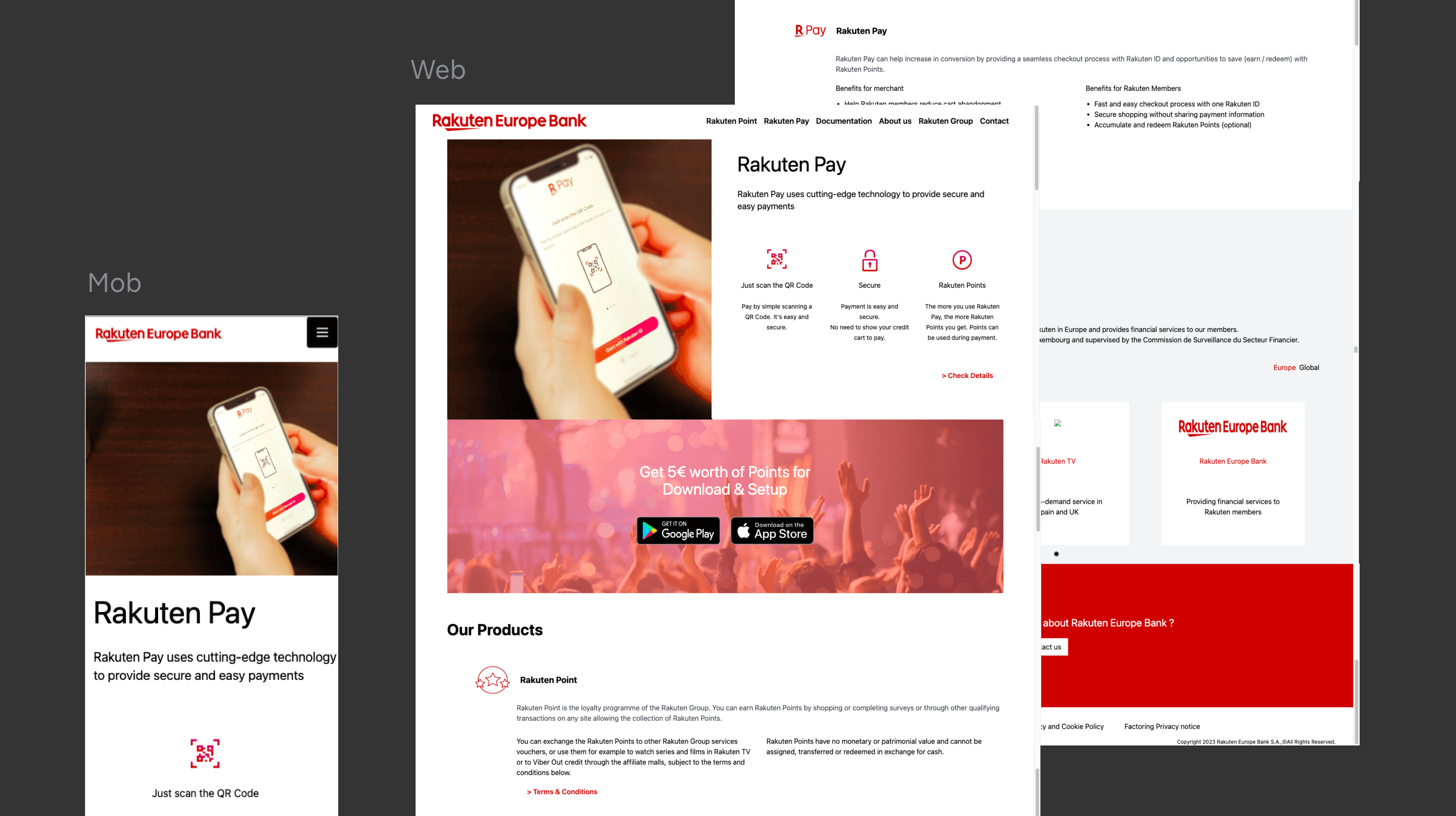
THE “BEFORE” DESIGN
The previous experience lacked a clear structure and direction.
Key products like Rakuten Pay were presented upfront without context, while other sections such as rewards, documentation, and company information appeared in a disconnected sequence.
Content was dense, text-heavy, and visually flat, with no strong hierarchy to guide attention.
Multiple CTAs existed, but without a clear priority or progression.
Overall, the page functioned more as a collection of information blocks rather than a cohesive user journey.
KEY USER TYPES & USER JOURNEY
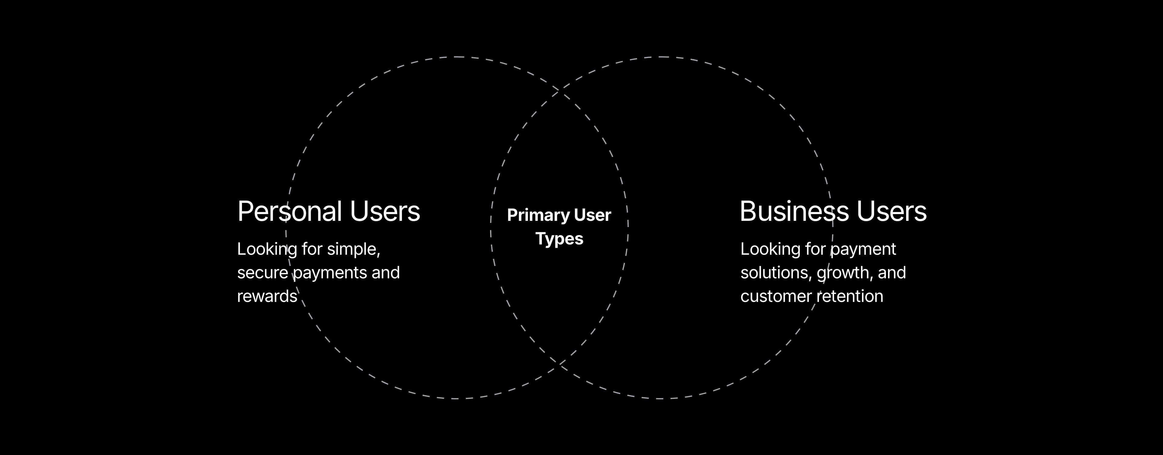
Journey Shift
Before:
Users land → try to understand the offering → scan irrelevant content → lose direction
After:
Users land → select Personal / Business → get relevant information → take action
Journey Breakdown
SETTING UP THE FOUNDATIONS
Before moving into visual design, I focused on establishing a strong structural foundation for the experience.
As a first step, I conducted a heuristic evaluation of the existing interface to identify usability gaps. The analysis revealed a lack of clear guidance, poor content prioritization, and high cognitive load due to unstructured information and competing elements.
The experience relied too much on user effort — requiring them to interpret, recall, and decide at every step.
These insights helped define the core design direction: simplify decision-making, improve hierarchy, and create a more guided flow.
From there, I built a scalable system by:
Defining separate content structures for Personal and Business journeys
Standardizing layout patterns, spacing, and typography
Creating consistent CTA hierarchy and interaction patterns
Ensuring responsiveness across devices
This foundation ensured the final experience remained clear, consistent, and scalable across all touchpoints.
Final Experience
Personal & Business Homepages
Introduced clear segmentation with tailored messaging and structured flows, allowing users to quickly identify their path and access relevant information.
About Us
Reframed content into a more structured, story-driven layout, improving readability and reinforcing brand credibility.
Outcome
A clearer structure, stronger hierarchy, and defined user paths resulted in a more intuitive and action-driven experience.
year
2023
timeframe
16 days
tools
Adobe XD
category
UI/UX

