
Fixing a Broken Hiring Experience in the Beauty Industry.
00

Overview
Beauty Job Agent is one of Germany’s largest niche job platforms focused on the beauty industry, helping professionals find roles across cities, brands, and categories. However, the experience didn’t match the urgency of job seekers. My Role: UX/UI Designer (collaborated with 1 designer) Scope: Landing page, job search UX, listing & detail pages Focus: Improving discoverability, reducing friction, increasing applications
Problem
The platform had strong content — but weak usability. Job search was not truly location-first, despite being a local hiring platform UI felt visually cluttered, making scanning difficult Mobile experience was hard to navigate and inconsistent Users explored… but didn’t convert 👉 The biggest issue wasn’t lack of jobs — it was the effort required to find the right one.
Solution
Instead of redesigning everything, the focus was clear: Make job discovery feel effortless and immediate. Prioritize location-based search Reduce visual noise Help users scan, compare, and act faster Guide users toward applying — not just browsing
IMPACT
The redesign focused on measurable behavior shifts:
↓ Reduced bounce rate
↑ More clicks on “Apply”
↑ Faster navigation across listings
↑ Improved mobile usability
Result: Users moved from browsing → applying
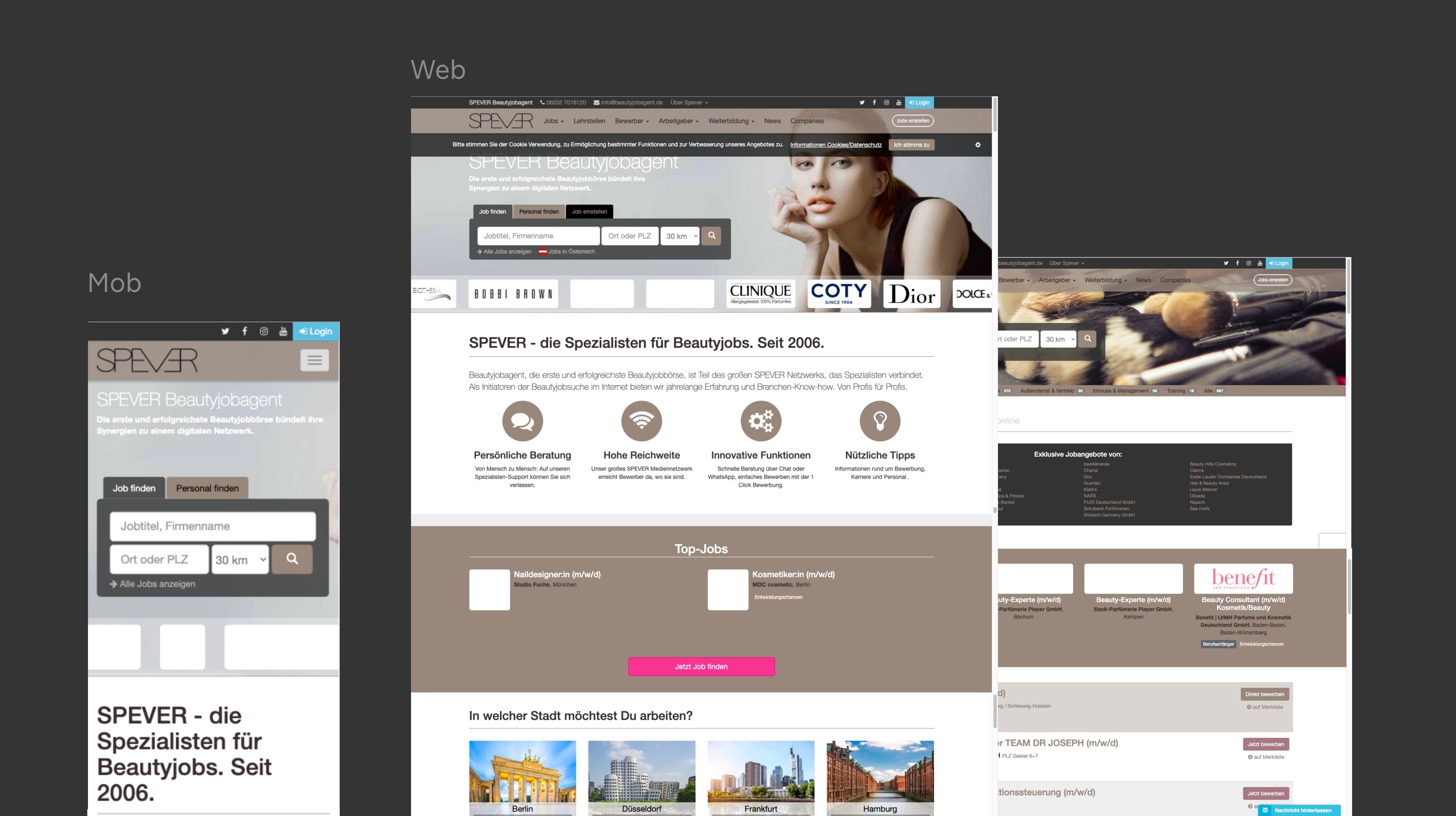
THE “BEFORE” DESIGN
The earlier experience created friction at multiple levels:
Search lacked strong local context
Job cards were dense and hard to scan
Important actions were not visually prioritized
Mobile layout felt compressed and overwhelming
KEY USER TYPES & USER JOURNEY
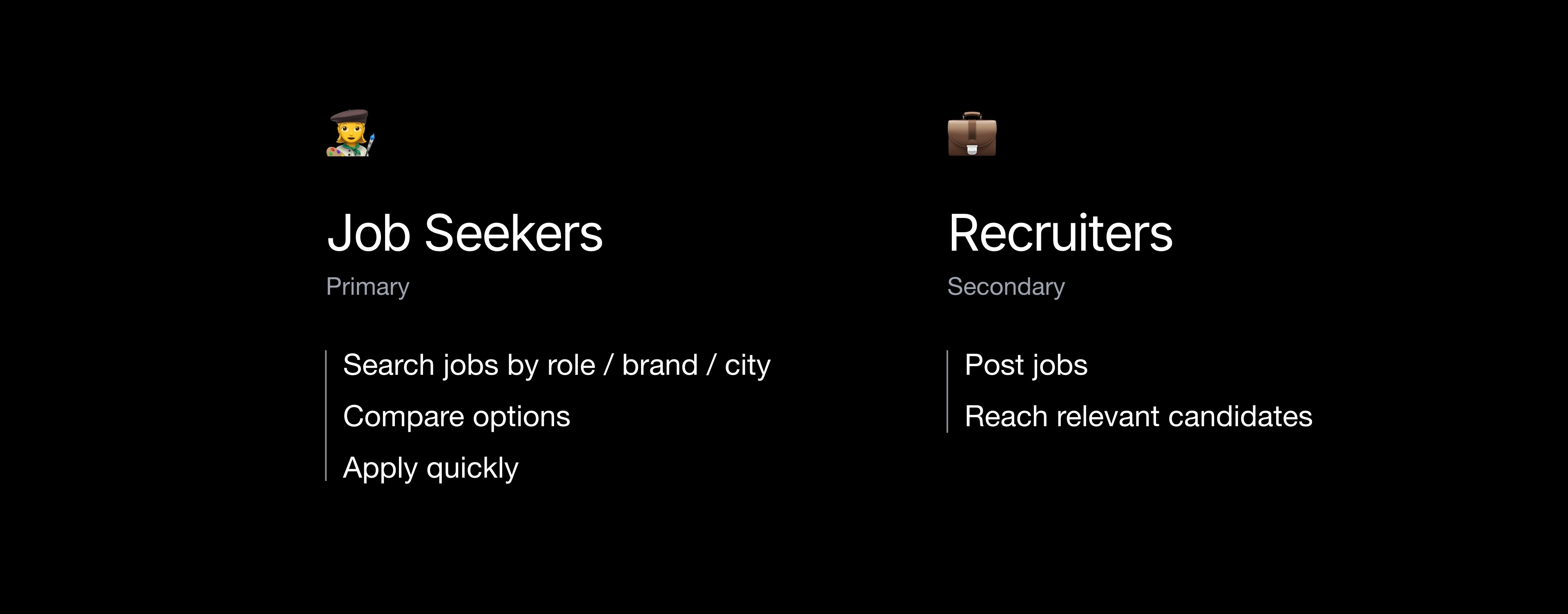
Journey Breakdown
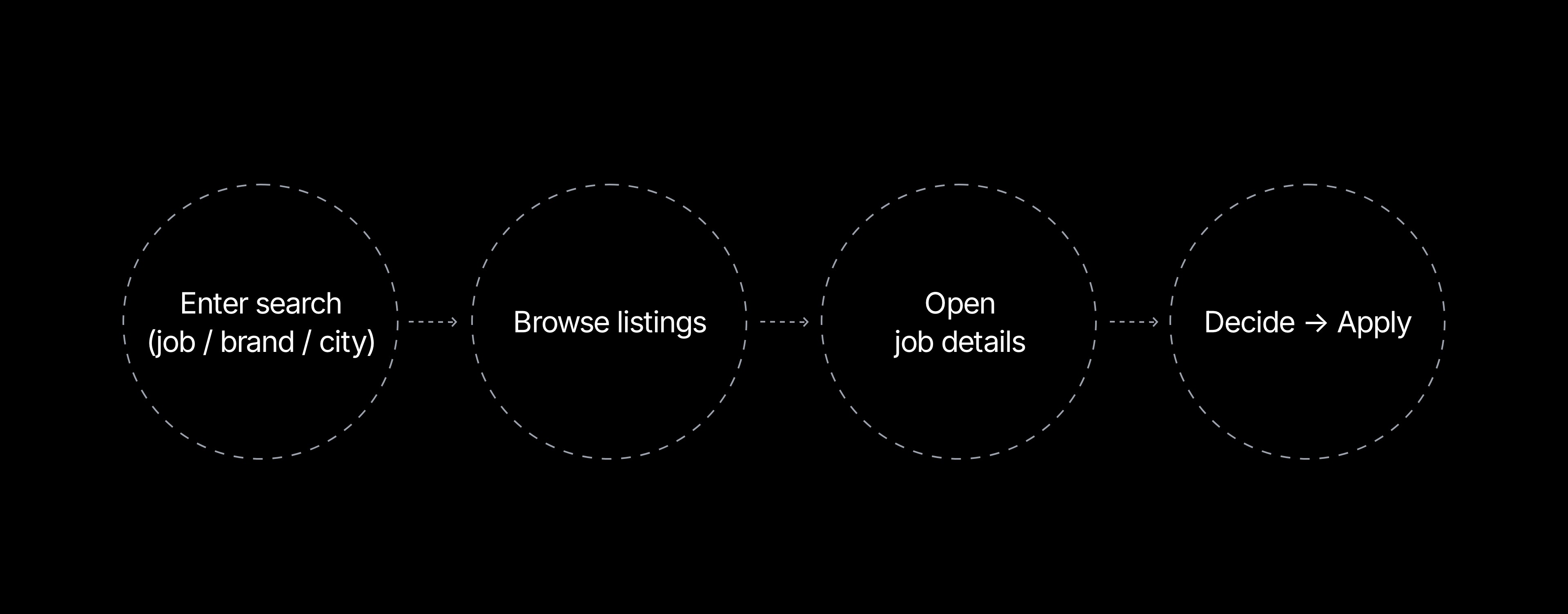
Between browsing and decision-making (Step 2 → 3)
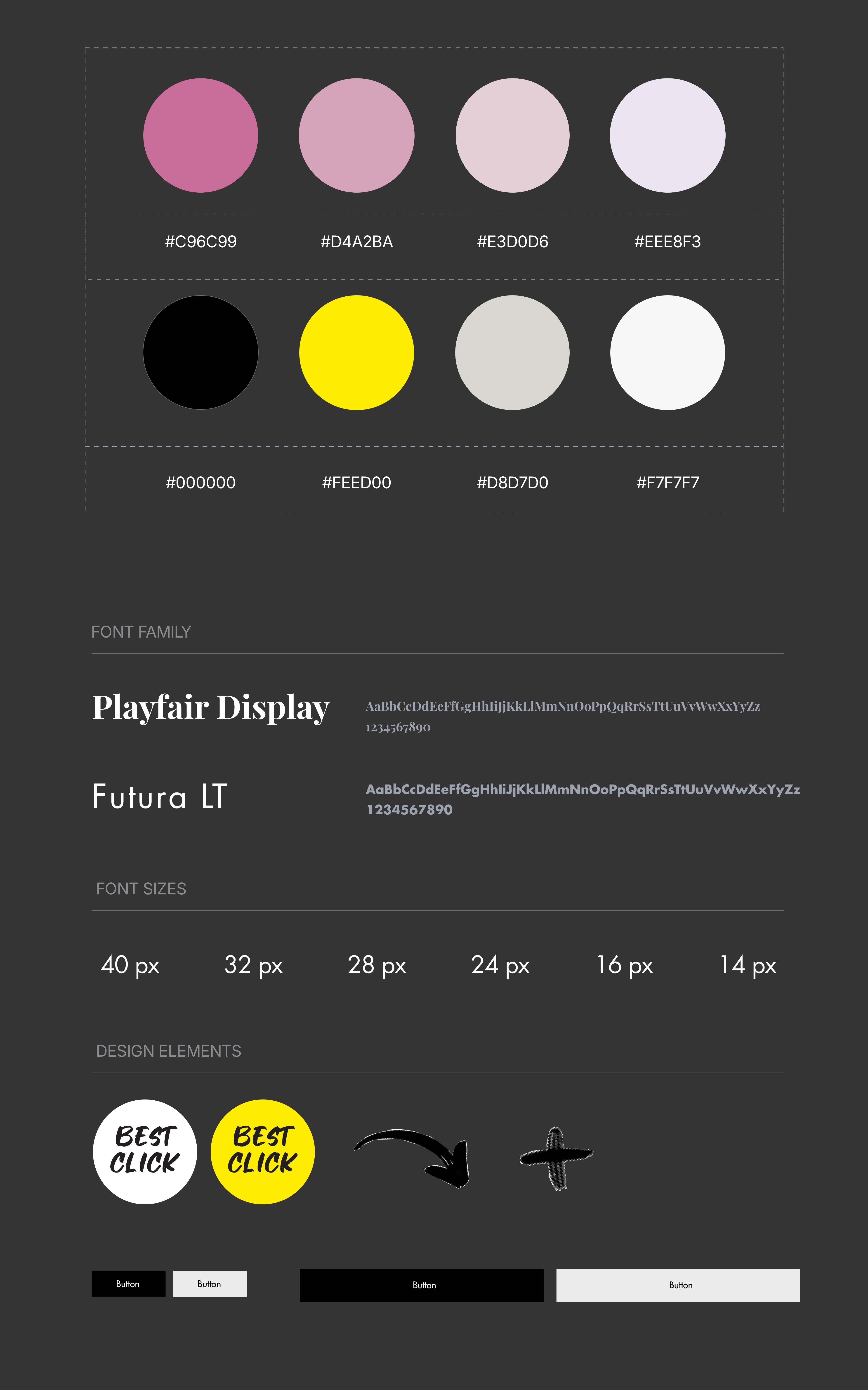
SETTING UP THE FOUNDATIONS
We spent four weeks building a strong foundation — a scalable design system created by a team of two designers.
It included core components like typography, color systems, icons, buttons, and structured layouts.
What started as a foundation quickly became a multiplier, the system is now used across 12+ modules and has been adopted by multiple client projects.
Final Experience
The final outcome focused on delivering a faster, clearer, and more action-driven experience across the platform.
A Simplified Entry Point
A redesigned homepage with a clear, location-first global search, helping users start their journey with intent.
A Scannable Job Listing Experience
Job listings were restructured to support quick comparison and effortless browsing.
Cleaner job cards
Stronger visual hierarchy
Simplified filtering
A Decision-Focused Job Detail Page
The job detail experience was redesigned to reduce hesitation and support faster decisions.
Structured information flow
Key details surfaced early
Clear and prominent “Apply” action
A More Useful Profile Dashboard
A streamlined dashboard that keeps users engaged beyond a single session.
Personalized job suggestions
Active application tracking
Centralized job activity management
Final Outcome
A cohesive experience that connects every step from searching to applying with clarity and speed.
year
2024
timeframe
4 Months
tools
Adobe XD
category
UI/UX

